DEGREE AUDIT PROTOTYPE
Target :
I am a BGSU student trying to find and schedule courses through the university degree audit, but knowing the positions, structure of the dozens of courses listed; the audit is near impossible to use due to the navigation lacking of descriptions and information given.
PROBLEMS
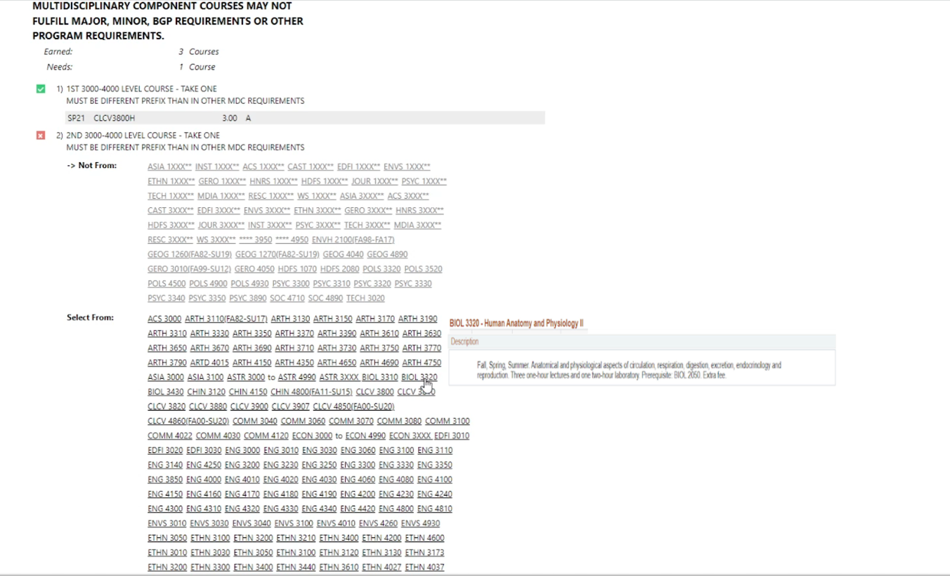
Picking multidisciplinary courses with the same prefix
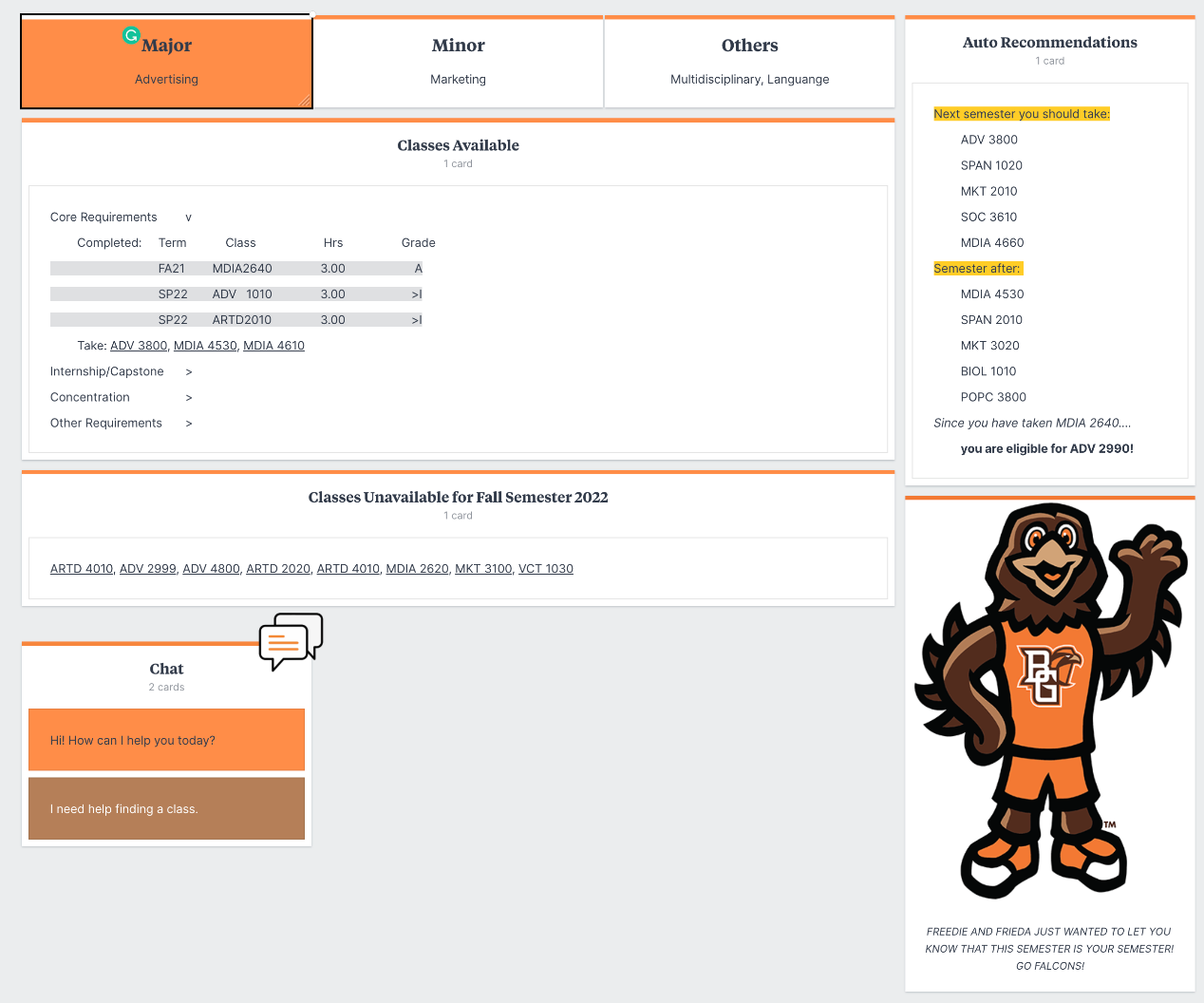
Students are not sure what class(es) to take next
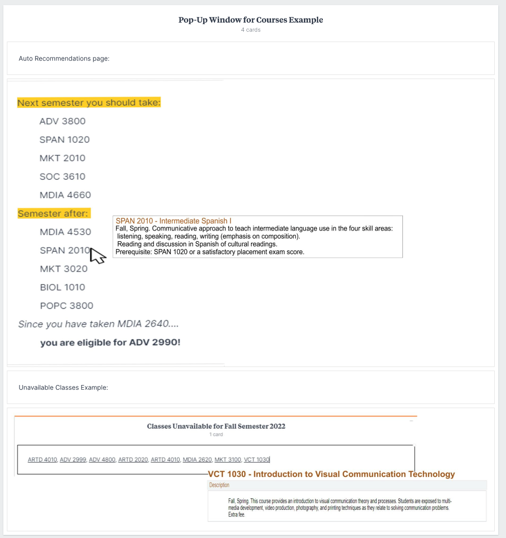
All courses are broken hyperlinks
SOLUTIONS
a. System declines the student’s choice
a. Auto-recommendations for students listed on the right side of the page
a. When hovered over, there would be a pop-up box that includes the class’ title and description
NEW AUDIT INTERFACE


COLORS / FONTS / ICONS
BGSU ORANGE : R:253/G:80/B:0*
HTML # FD5000*
HTML # FD5000*
BGSU BROWN : RGB: R:79/G:44/B:29*
HTML color # 4f2c1d*
HTML color # 4f2c1d*
white : RGB: R.255/G:255/B:255*
HTML COLOR # FFFFFF*
FONTS / COLOR SCHEME WILL STAY ON PAR WITH BGSU BRAND.
Helvetica Neue", Helvetica, Arial, sans-serif;
WHY SOLUTIONS WILL WORK
a. these solutions are not only going to assist first-year students who tend to overthink their schedule, but also upperclassmen with their particular schedules needing to be able to participate in internships, co-ops, or their jobs.
a. The declining system will help eliminate the prefix tracking done by the student.
a. The auto-recommendations will assist students in graduating on-time or earlier.
a. The pop-ups will help students ensure they are enrolling in the correct class at their preferred time.
CURRENT BGSU BRANDING FOR REFERENCE
